aelf Design
A UI component library based on Antd and compliant with aelf visual specifications
website: https://aelf-design.vercel.app/
Install
$ yarn add aelf-design
Usage
import { Button } from 'aelf-design';

const App = () => {
  return (
    <div>
      <Button>default</Button>
    </div>
  );
};

export default App;
Development
$ git clone https://github.com/AElfProject/aelf-design.git
$ pnpm i (if there is not pnpm,please npm install -g pnpm first)
$ pnpm dev
Publish
- Upgrade the version numbers of each sub package
- execute release command in the project root directory
$ pnpm release
How to contribute components to aelf-design
Prerequisite knowledge
Design token
In antd 5.0, the smallest element that affects the theme is called the Design Token. By modifying the Design Token, various themes or components can be presented. By passing the theme property in the ConfigProvider , the theme can be configured
import { Button, ConfigProvider, Space } from 'antd';
import React from 'react';

const App: React.FC = () => (
  <ConfigProvider
    theme={{
      token: {
        colorPrimary: '#00b96b',
        borderRadius: 2,
      },
    }}
  >
    <Space>
      <Button type="primary">Primary</Button>
      <Button>Default</Button>
    </Space>
  </ConfigProvider>
);

export default App;
In addition to the overall Design Token, each component will also open its own Component Token to achieve the ability to customize the style of the component, and different components will not affect each other
import { Button, ConfigProvider, Space } from 'antd';
import React from 'react';

const App: React.FC = () => (
  <ConfigProvider
    theme={{
        components: {
          Button: {
            colorPrimary: '#00b96b',
            borderColorDisabled: '#d9d9d9'
          },
          Input: {
            colorPrimary: '#eb2f96',
          }
        },
    }}
  >
    <Space>
      <Button type="primary">Primary</Button>
      <Button>Default</Button>
    </Space>
  </ConfigProvider>
);

export default App;
Details: https://ant-design.antgroup.com/docs/react/customize-theme#design-token
antd-style
Antd-style is a business-level css-in-js solution built on Ant Design V5 Token System
createStyles
import { SmileOutlined } from '@ant-design/icons';
import { Button, Space } from 'antd';
import { createStyles } from 'antd-style';

const useStyles = createStyles(({ token, css, cx }) => {
  const commonCard = css`
    border-radius: ${token.borderRadiusLG}px;
    padding: ${token.paddingLG}px;
  `;

  return {
    container: css`
      background-color: ${token.colorBgLayout};
      padding: 24px;
    `,

    defaultCard: css`
      ${commonCard};
      background: ${token.colorBgContainer};
      color: ${token.colorText};
    `,

    primaryCard: cx(
      commonCard,
      css`
        background: ${token.colorPrimary};
        color: ${token.colorTextLightSolid};
      `,
    ),
  };
});

const App = () => {
  const { styles } = useStyles();

  return (
    <div className={styles.container}>
      <Space direction={'vertical'} style={{ width: '100%' }} size={16}>
        <Space>
          <Button icon={<SmileOutlined />} />
          oprerate button
        </Space>
        <div className={styles.defaultCard}>defalut card</div>
        <div className={styles.primaryCard}>primary card</div>
      </Space>
    </div>
  );
};

export default App;
The createStyles method can pass in a function with the following signature:
type GetCssStyleFn = (utils: CreateStylesUtils, props?: Props) => StyleInput;
Below is a detailed introduction to the functions of each attribute
CreateStylesUtils
The first parameter used when writing styles, utils, provides a series of auxiliary objects and methods that facilitate style writing, improving the efficiency of style writing. Its type is CreateStylesUtils, and the property table is as follows:
| Attribute name | Type | Description |
|---|---|---|
| css | CssUtil | CSS serialization function |
| cx | ClassNamesUtil | CSS class name tool function |
| responsive | ResponsiveUtil | Responsive media query tool function |
| token | FullToken | Contains antd's token and all custom tokens |
| appearance | ThemeAppearance | Current theme mode under ThemeProvider. 'dark' | 'light' | string |
| isDarkMode | boolean | Syntax sugar can be directly used with isDarkMode to reduce the cost of appearance judgment.Equivalent to appearance === 'dark' |
| prefixCls | string | The prefix marked on the ThemeProvider can obtain the current component prefix, making it easier to respond to component prefixes more flexibly |
ThemeProvider
ThemeProvider has done secondary encapsulation on the basis of ConfigProvider, providing a more convenient way to customize themes
Custom Tokens can be injected through the customToken method of ThemeProvider
import { ThemeProvider } from 'antd-style';

export default () => {
  return (
    <ThemeProvider customToken={{ customBrandColor: '#c956df' }}>
      <App />
    </ThemeProvider>
  );
};

// consume customToken
css`
  background-color: ${token.customBrandColor};
  padding: 24px;
`
Develop aelfd component
1. According to the component design draft, identify the differences with the antd component
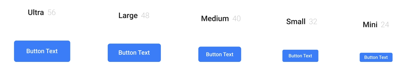
- 5 size types need to be provided, antd has 3
- Different sizes of height, padding, rounded corners, font size, and minimum width are different
2. List the new features based on the antd component
- Provide optional throttle click function
3. Configure token
Component tokens required to configure this component, global tokens (pay attention to whether it will affect other components), and custom tokens.
<ThemeProvider
    customToken={{ customBrandColor: '#c956df' }}
    theme={{
        components: {
          Button: {
            colorPrimary: '#00b96b',
            borderColorDisabled: '#d9d9d9'
          },
          Input: {
            paddingBlock: 11,
            paddingBlockSM: 7,
          }
          ...
        },
        token: {
            colorPrimary: '#1370DD',
            colorPrimaryHover: '#3689DD',
        }
    }}
/>


theme?: ThemeConfig | GetAntdTheme;
4. Define aelfd component type file
export type AelfdButtonSizeType =
  | 'mini'
  | 'small'
  | 'medium'
  | 'large'
  | 'ultra'
export interface IAelfdButtonProps
  extends Omit<ButtonProps, 'size' | 'onClick'> {
  size?: AelfdButtonSizeType
  onClick?: React.MouseEventHandler<HTMLElement>
  millisecondOfThrottle?: number
}
5. Writing component logic and style files
const useStyles = createStyles(
  ({ css, prefixCls }, { size }: { size: AelfdButtonSizeType }) => {
    const dynamicWidth =
      size === 'mini'
        ? '24px'
        : size === 'small'
        ? '32px'
        : size === 'medium'
        ? '40px'
        : size === 'large'
        ? '48px'
        : '56px'

    return {
      buttonWrap: css`
        display: flex;
        align-items: center;
        justify-content: center;
        flex-shrink: 0;
        // ...

        &.${prefixCls}-btn-circle {
          min-height: ${dynamicWidth};
          height: ${dynamicWidth};
          font-size: 14px;
        }
        &.${prefixCls}-btn-icon-only {
          min-width: auto;
          width: ${dynamicWidth};
        }
      `
    }
  }
)
Previously, if you needed to override the style of the antd component, you needed to use: global to override it. Now, you can simply remove: global
Vs code plugin
vscode-styled-components